Origins
I made my first personal website nearly two years ago. The goal behind it was to make something that was unique to me but also something that just worked, since it would help me in the upcoming recruiting season and I needed something to present.
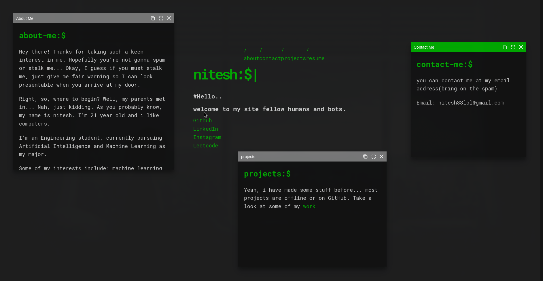
The First Attempt: Windows in a Browser
I stumbled across WinBox.js, a library that provides a professional and fully customizable HTML5 window manager for the web. So I put together something quickly with just basic HTML, CSS and JS and came up with the website you’re seeing below — at least a single page of it.
I’ve seen so many cool personal websites over the years, and I never wanted to get lost in the sea of portfolios that all look the same. What I love most about browsing people’s personal sites is how they capture personality — you’re not just seeing someone’s work, you’re learning who they are as a person. (Seriously, go look at leohliu.com if you want to see what I mean.)
So, I began to reflect on myself.
The Linux Terminal Redesign
So, I chose something most developers take for granted: the terminal. It’s something most developers use every single day, often without giving it a second thought. I decided to build a Linux terminal-themed website.
I liked how this looked but there was a problem: there wasn’t much actually going on. The site was all style and no substance. The contents felt too informal. It wasn’t quite ready to put in front of a recruiter.
Finding the Right Direction
Around the same time, I was doing a lot of thinking about what kind of engineer I wanted to be. I realized I wanted to be someone who questions how systems work and truly dives deep into understanding them. When I first started building things, I didn’t take the time to learn how tools worked from the ground up. It wasn’t until this year that I gained clarity on how these pieces of technology operate under the hood and I found it fascinating.
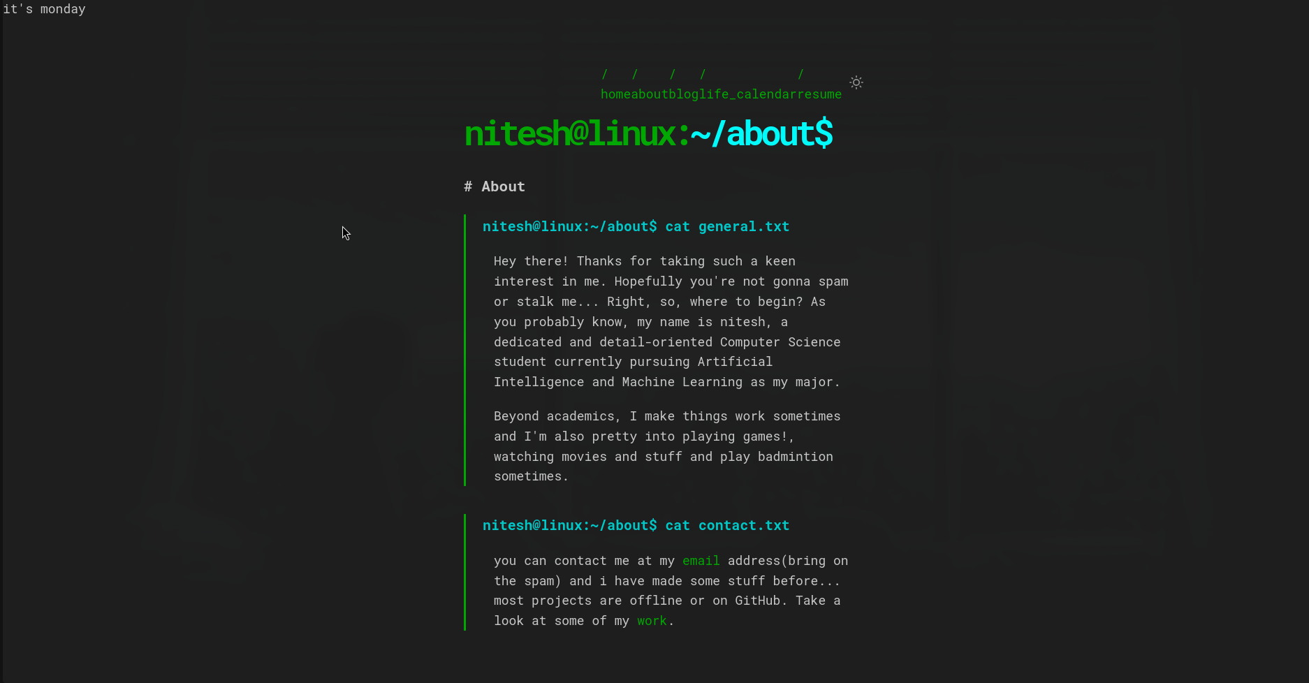
The Final Version
I ended up with something I’m genuinely happy with. It’s clean, minimal, and a lot more intentional than what came before. The navigation moved to the side, the links section got a full rework, and the overall tone shifted from “look how quirky I am” to something a bit more grounded.
There’s still room to grow — there always is. But this version felt like a website I could actually stand behind.